The task
One thing I love about design is the variety of tasks it brings my way. Whilst I’m usually an app and site designer, recently I was given a more unusual challenge. My task was to design an ekreative themed superhero (called Ekreator) for use in some comic form advertising material for our company.

Inspiration
Obviously I was pretty excited at the prospect, classic images of batman, spiderman and wolverine instantly flashing through my mind as possible inspiration points. There’s a lot out there to draw ideas from; straight away I found myself in a sea of images of muscle bound, warrior types, each one meaner (and cooler) looking than the last.
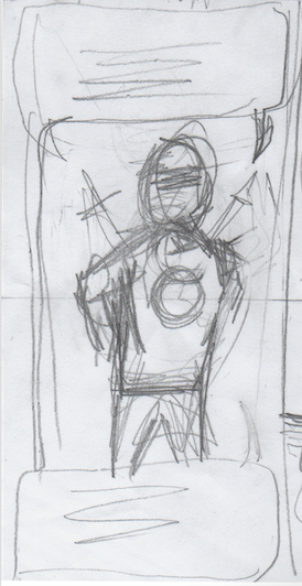
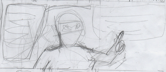
Initial draft
Once I got the copy and approximate storyboard plan for the comic, I drew up a very rough version, mostly to establish the panel layout and speech areas. You can see from these non-detailed sketches though that at this stage I was envisioning our hero as a two sworded, deadpoolesque, ninja style hero with a definite dark streak.

A more positive approach
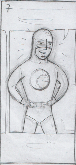
For our material though we needed a hero who would represent our company. They needed to be not only heroic, but also positive, trustworthy and more than a little geeky. Thinking about the characteristics of heroism, positivity and trustworthyness, I started looking at a lot of cloaked, superman types for inspiration. I found myself underwhelmed by the fact that they were all very similar to each other and relied on having ridiculously superbuff bodies to project a sense of power. Instead, DC’s Flash caught my eye as an example of a hero whose distinctive logo and uncloaked costume underline his specialised skills and hint at his approach to solving problems.
Attempting a similar approach, I used my 2nd draft to try out my ideas and give Ekreator a more fixed, positive form. I tried to draw emphasis to a stylised version of our company logo by having a simple costume design which wouldn’t distract from the main message. You can see the result below.

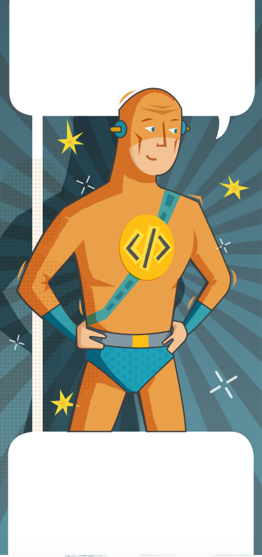
A programming superhero
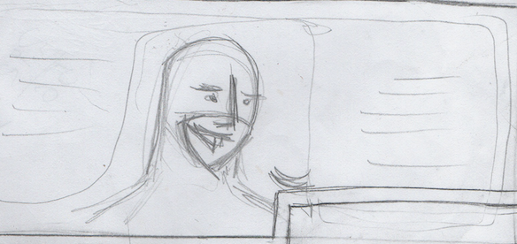
I was still keen to make Ekreator more obviously associated with programming, so before I set to work on the digital version, I made a few more pencil sketches to try and make him stand out. You can see that I switched the company logo (which would be appearing elsewhere in the advertising) to a clearer coding reference and gave him some Flash inspired on/off switch earpieces.


Colour time
I was pleased with the way he was looking in pencil, but now it was time to convert to digital and add in some colour. A lot of our company branding comes in orange, so it seemed an obvious choice for Ekreator’s outfit. You can see below I chose to add in some blue vambraces on his forearms and a sort of strap or utility belt across his body.
I need a hero
Whilst it was gratifying to see Ekreator in this more complete form, somewhere along the line I couldn’t help feeling he’d lost his heroic edge. It suddenly seemed that he looked more like a boy dressed in Ekreator pyjamas than like a genuine superhero. I decided to go back and bulk him out a bit, trying to make him seem formidable without overemphasizing the muscles as I’d seen in so many examples. Also, to bring the focus back to the logo I tried scrapping the blue hero pants, the utility belt and even the earpieces.

The final version
Whilst our hero now offers less visual clues to his profession, the context and dialogue make that clear; Ekreator himself is used to project the unspoken elements of Ekreative’s character: confidence, resourcefulness and a sense of being able to deal with any problems. Given that renewed emphasis on his role as a representative of our company, you’ll have noticed that I again switched the logo back to being our company logo.
In the final piece, this is the version of Ekreator that we used.
Check out below the complete design journey of the creation of Ekreator:


