A high level of user retention is a critical customer success KPI for apps with subscription-based business models. It’s pretty essential for software with in-app advertising or in-app purchases too! As we look for ways to increase retention, the first idea that might come to mind is to increase engagement, with push notifications or in-app achievements. Today though, I want to focus on another strategy which can bring significant improvements to retention levels, namely the app UI.
Overview of UI user retention tips:
- Modify onboarding. A user’s first encounter with your app impacts whether or not they will use the app. Make onboarding user-friendly with the help of our hints.
- Make key features easily accessible. Ensure features your users use most often are within reach and visible.
- Utilize clear space. Overcrowded screens are both confusing and disruptive for your app speed. Simplifying your user’s experience is likely to increase their willingness to stay with your app.
- Add appropriate animation. Animation might help add clarity, but it can be frustrating as well. Consider whether your animation is on point and how it influences app performance.
- Use native UI elements. Each mobile platform has its design guidelines which create a consistent user experience within a device. Do not underestimate the suggested rules to promote good user experience.
First off, let’s look at some guiding principles and then we’ll dig deeper into some specific examples.
General guidelines
The key thing about user retention is that users keep going back to an app which brings clear benefits. That value can get lost though, if the user gets confused or pushed aside by elements inside the app that divert attention. Thus understanding and navigating the app should be simple enough that they don’t erode the users perception of the app’s benefit.
Another key factor that will be mentioned in the hints below is the app speed. The reality is that users like fast software. People don’t want to wait. An app that takes a long time to load or performs too slowly provokes users to abandon using your app.
One more vital UI principle that helps explain a couple of the hints discussed below is that users like to do and be shown instead of reading and being told. It’s a guideline rather than a strict rule to follow, but basically, it’s preferable to demonstrate a feature in action and push users to try it, than to describe it with detailed text.
With these general recommendations discussed, let’s have a closer look at some particular app elements and reveal how they influence retention.
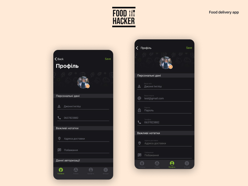
1. Onboarding is crucial
Typically, users get their first impression/ have their first contact with your app during the onboarding. If your app is relatively simple to use and brings the user straight to the point, excellent! Many apps, however, require some guide, tutorial, or explanations. There could be many variations, but it’s vital that at this initial stage of app usage, that the user gets a crash course on how to benefit from the app and begin using it.
Users don’t have to understand how every feature works at the start. They don’t require detailed explanations of the key features. They just need to experience the apps’ advantages for themselves right away.
For certain types of business model, onboarding is critical to the user’s subscription purchase decision, so it is pivotal in the design process. No matter the business model, users often base an app review upon their first experience. As reviews play a significant role in ASO, this adds even more reason to ensure users discover the potential of the app as quickly as possible.
After the app’s first experience, the user can still continue exploring other features, during an extended onboarding time that allows them to get more benefit from your app.
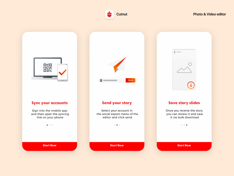
CutNut added pre-login screens as a part of their onboarding to set user expectations.
We experimented with everything from introductory video messages to overlays with annotations, to step-by-step tutorials and more. There are so many options out there on how to get more out of your application. The way you should choose depends on your app type, the feel of the app and the demographics you rely on. So be sure you’ve decided what onboarding UI strategy will be appropriate for your setup, evaluate its implementation and as soon as it’s live, adjust it and analyze how modification of your onboarding influences your initial retention.
2. Feature availability
To motivate users to keep getting back to your app, ensure that the functions they use most often are most available. That is, place them on the homepage of your app or at most one tap away. It also implies representing them with big, clear buttons.
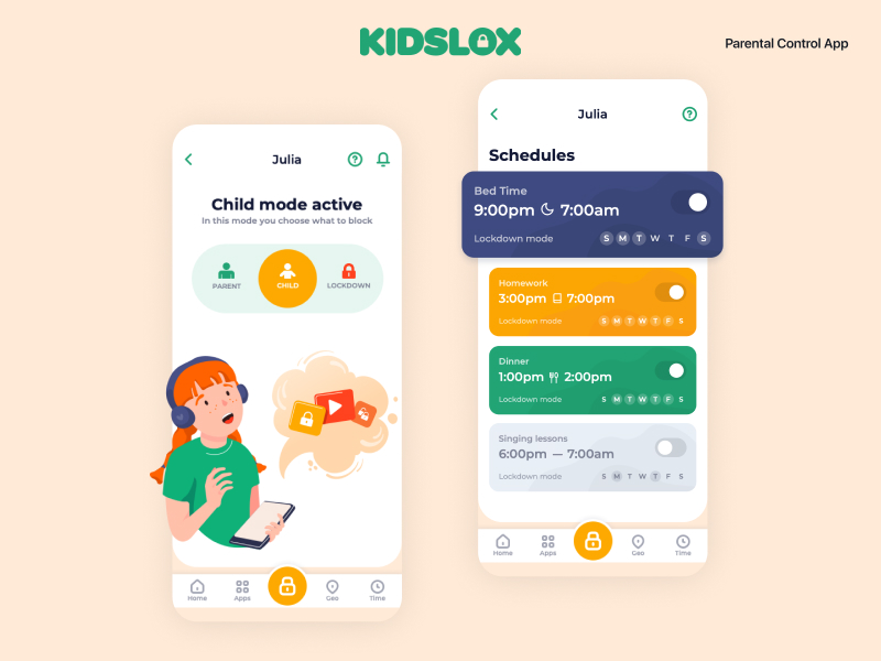
Kidslox offers a number of features. On the basis of actual usage data, we saw that a toggle was the most used feature and prioritized it’s placing to make it more accessible
The truth is that the number of screens a user needs to go through before they reach what they really want can be crucial to accelerating their experience. When a user passes through many other screens first, it indirectly communicates to them any of the following:
- your application is difficult to use – in that case, they’ll be less prone to stay and explore its complexity
- the app has poor design – in that case, they’ll begin to expect more illogical or inconvenient elements
- that they are nor an average user – and probably their needs might be best addressed by a different app which prioritizes the functionality for which they’ve come
In case your app includes plenty of features, it would be challenging to organize them just on one page. No matter what kind of navigation you utilize to lead users to other features – tabs, menus or other techniques, pick up one or two core or most requested features to emphasize first. If your UI permits it, think about adding “favourites” or “recently used” functions to let users select which features to prioritize and make sure they’re within easy reach.
3. Use free space
This advice might seem to be in conflict with my last point, as there’s a temptation to pile lots of features on the home screen when you know how important feature availability is. However, in most cases this is likely to be a mistake.
Clumsy screens with multiple menus and buttons will probably:
a) slow down your app performance
b) onfuse users
Both of them will harm retention.
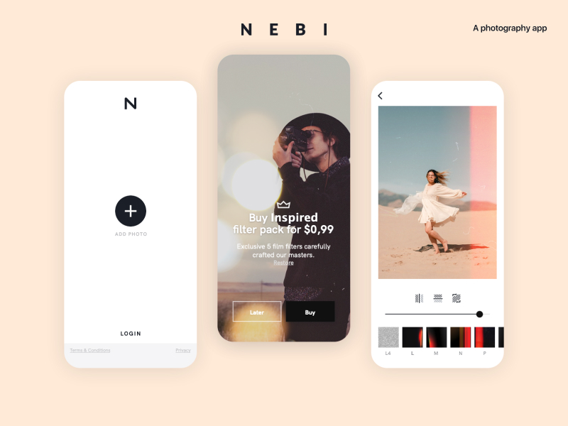
Nebi’s simple design helps to establish clarity for a user and a stylish app look.
Removing the unnecessary and streamlining an experience to the basics is a standard UI approach. Even if it’s not always desirable or possible to resort to full on minimalism, it’s preferable not to overload your users either.
Technically speaking, an overloaded screen design will often force developers to place views over other views. When a pixel gets overdrawn multiple times, the device wastes more resources to draw the screen and as a result, the app performs slower. So there are multiple reasons to keep your screens clean and uncluttered.
4. Animation: to be or not to be
Animation can make your application more attractive and add more clarity, but at the same time, it might also cause slow app performance. If users are forced to wait for animations to load before taking another step, this might cause frustration.
Thus, ensure your use of animation is well-considered. Ask yourself “in what way does this animation make the app clearer for a user?”
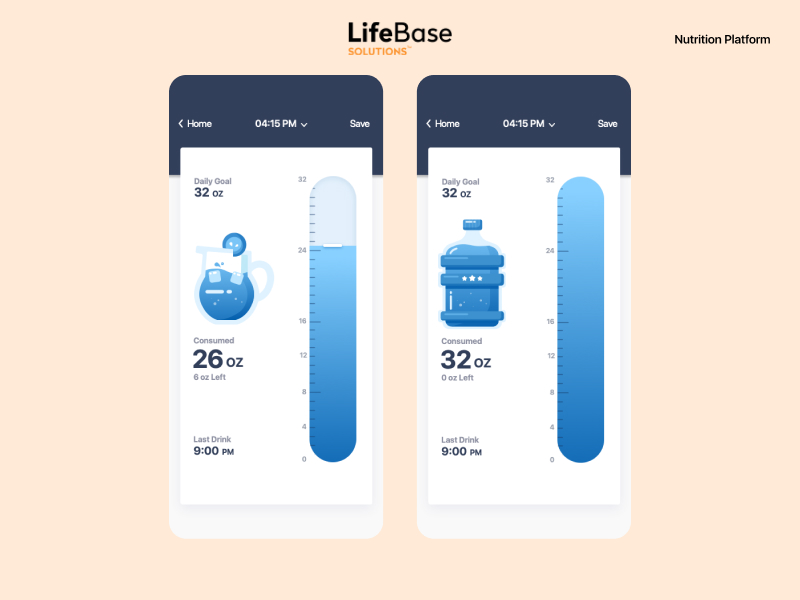
This animation helps users of Lifebase to visualize their water consumption
Decent animation improves the user journey, makes it easier and more exciting. Animation per se slows things down and might even interfere with a flowing user experience, so use animation reasonably.
5. Exploit native UI
If you ever face the temptation to create identical iOS and Android UIs, think twice. Obviously, in the majority of cases you strive to establish maximum continuity and consistency of user experience between the two builds. Meanwhile, compliance with platform design guidelines is not just a matter of box ticking. It ensures consistency on the user’s device, making your app seem like a natural extension of the platform’s offering. Moreover, native UI components are consistently faster than their alternatives.
Not a single user will compare both versions of your app and make a fuss because of slight differences in the button design. Hence, please use the native UI elements and benefit from how they speed up your app.
The difference between the provided iOS and Android version of one app is small, but they shape an experience consistent with the platform used.
The iOS and Android design guidelines also provide a range of reasonable ideas on enhancing UI in general. There are guidelines concerning where on the screen to place key buttons (it’s easier to tap the bottom of the screen than the top), rules regarding proper sizes and proportions for various kinds of buttons, all sorts of practical suggestions. Ensure your designers know the platform guidelines and have analyzed why those rules are beneficial for user experience.
UI as a part of a broader retention strategy
UI solutions are the right place to look when working to increase user retention. Yet they are not the only place, as these steps should be taken alongside your engagement building strategy, emails, pushes, effective support, customization options, etc. Reviewing your app UI and considering how it influences your user retention is a positive step. After this, whichever way you modify your app’s UI, filter your decisions in the same manner: how will this interface solution impact a user’s long-term decision to continue using your app?


Related Posts
Agentic Teams vs Sub-Agents: The AI Architecture Decision Most Teams Get Wrong
Why the difference between “more agents” and “better thinking” quietly determines whether your AI investment compounds, or stalls out The…

The Importance of Vendor Management in Healthcare Software Projects
In the dynamic and ever-evolving landscape of healthcare, software projects play a pivotal role in enhancing patient care, streamlining operations,…

The story of Templify app – our new product launch
Well, hello! It’s been a while since I wrote, but it’s about time I get back into it. I wanted…